Henry & Tunks
2006Henry & Tunks is start-up industrial design label. Branding was required to establish the brand logo and company business card and stationery, with a view to develop further into packaging, promotion and online.
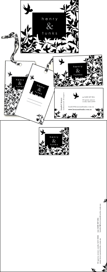
The brief described a logo that was sophisticated, evocative and have an uniqueness that would leave a lasting impression. Our client hoped the logo could include imagery of a bird and an apple for sentimental reasons and was interested in the design style of 1920's in both western and eastern culture.
I asked the client to send any images they particularly like and I also have our own scavenge to help develop a theme for the branding. Combining this imagery and our own imagination I sketched some thoughts and then headed to the computer to create a number of logo concepts.
After emailing the examples to the client and then listened to their feedback. For this logo I combined different elements of each design into a final logo design. The result being a logo and branding that both the client and I adore.
I then creatively incorporated the design into the branding of business cards, swing tags and other elements required.